PLUNA AIRLINES
HELPING AN ICONIC BRAND TAKE FLIGHT
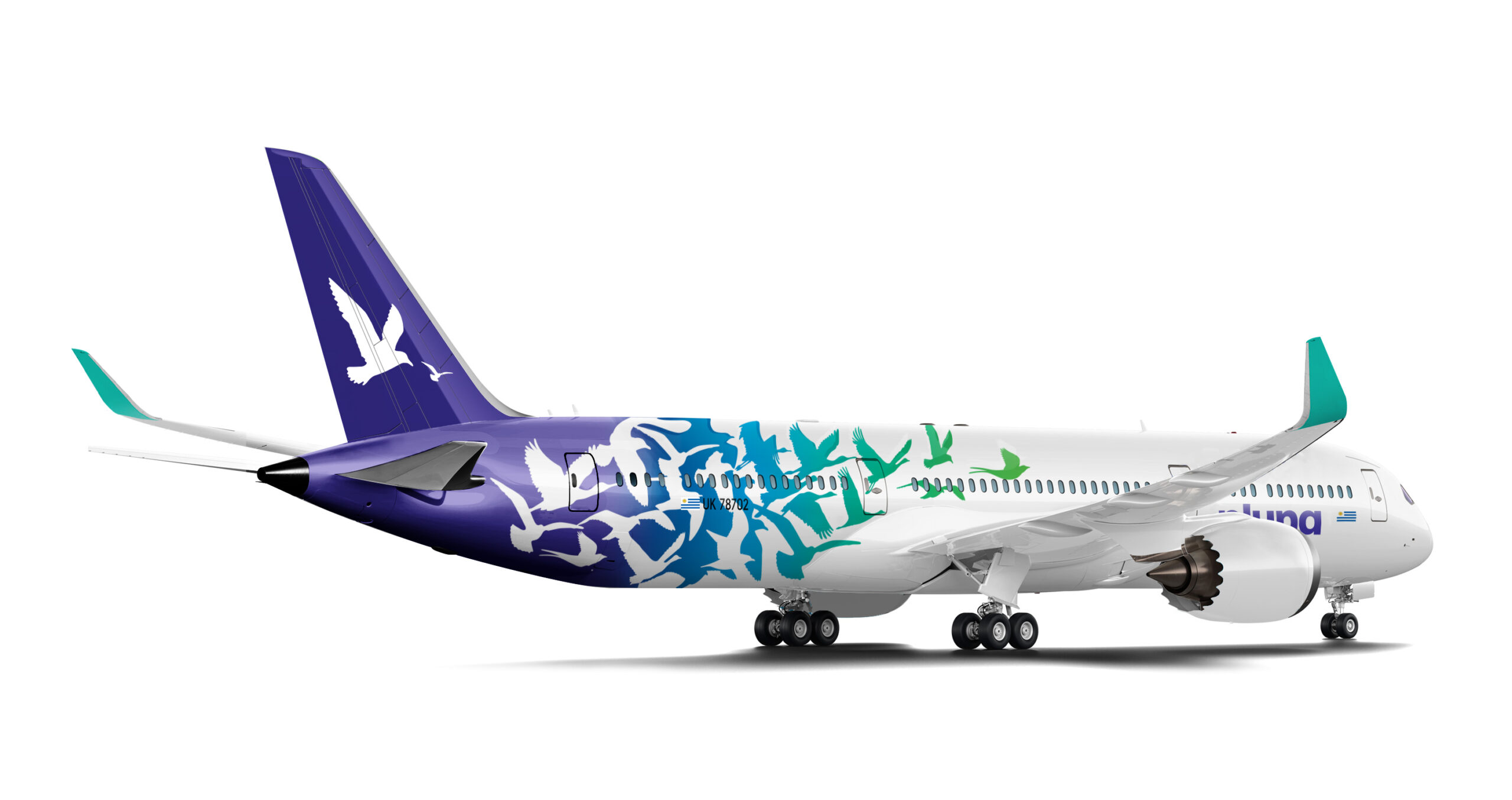
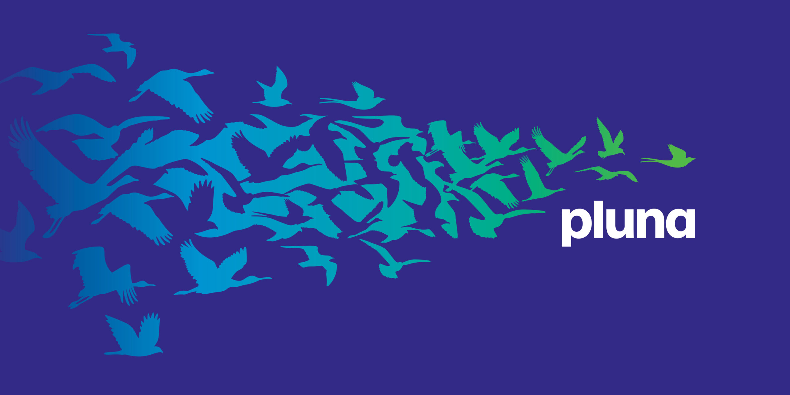
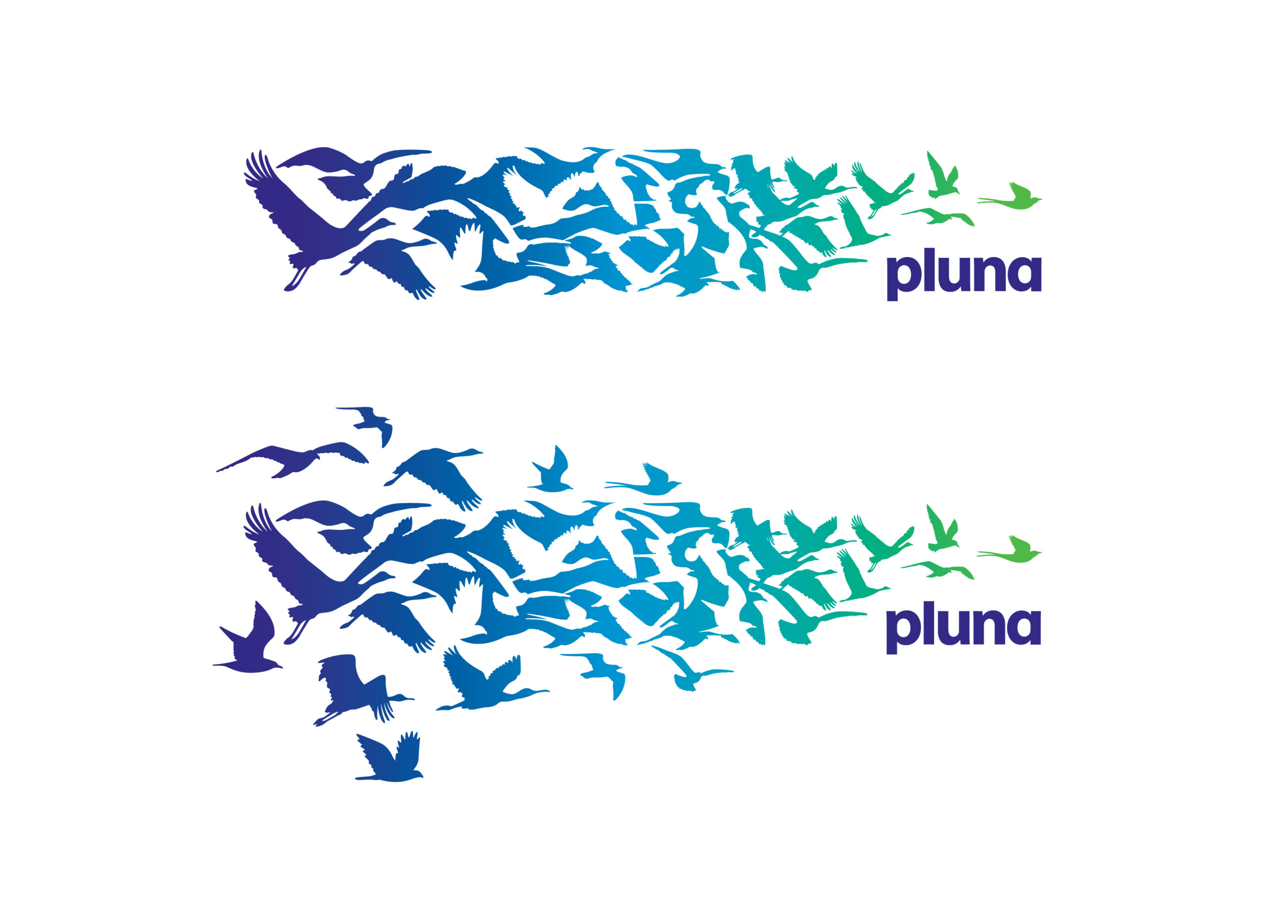
Pluna™, the former national airline of Uruguay, approached Cato Brand Partners™ with the goal of reinvigerating their brand and creating a new identity that would instil a deep sense of identity and pride. The name Uruguay itself means 'a river of colourful birds'. As part of the design team, I was involved in conceptualising and developing the new brand identity and strategy with rollout across a variety of applications.
CATO BRAND PARTNERS™ MELBOURNE - 2011 - MID-WEIGHT DESIGNER

A NEW LOOK THAT SOARS
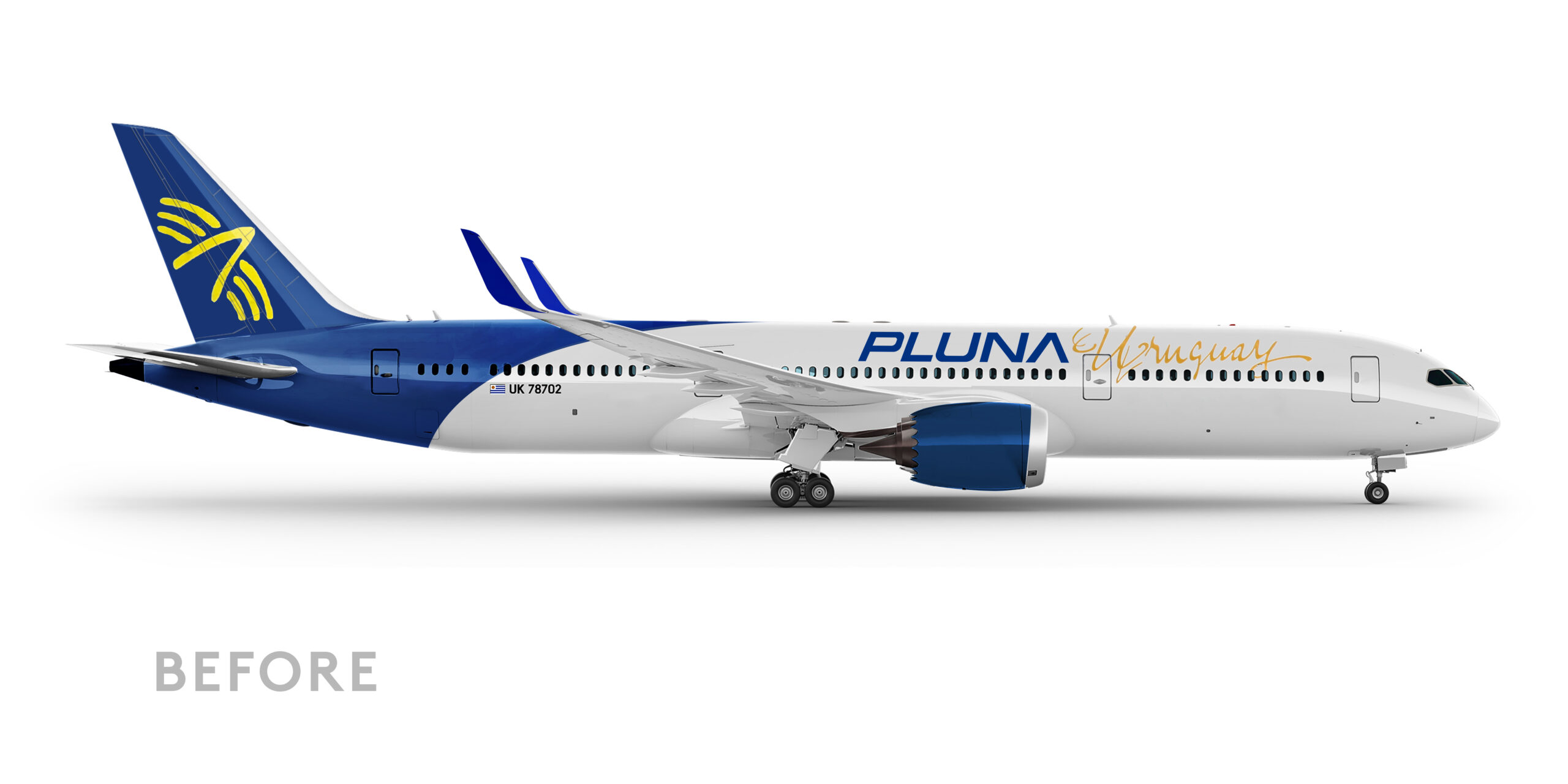
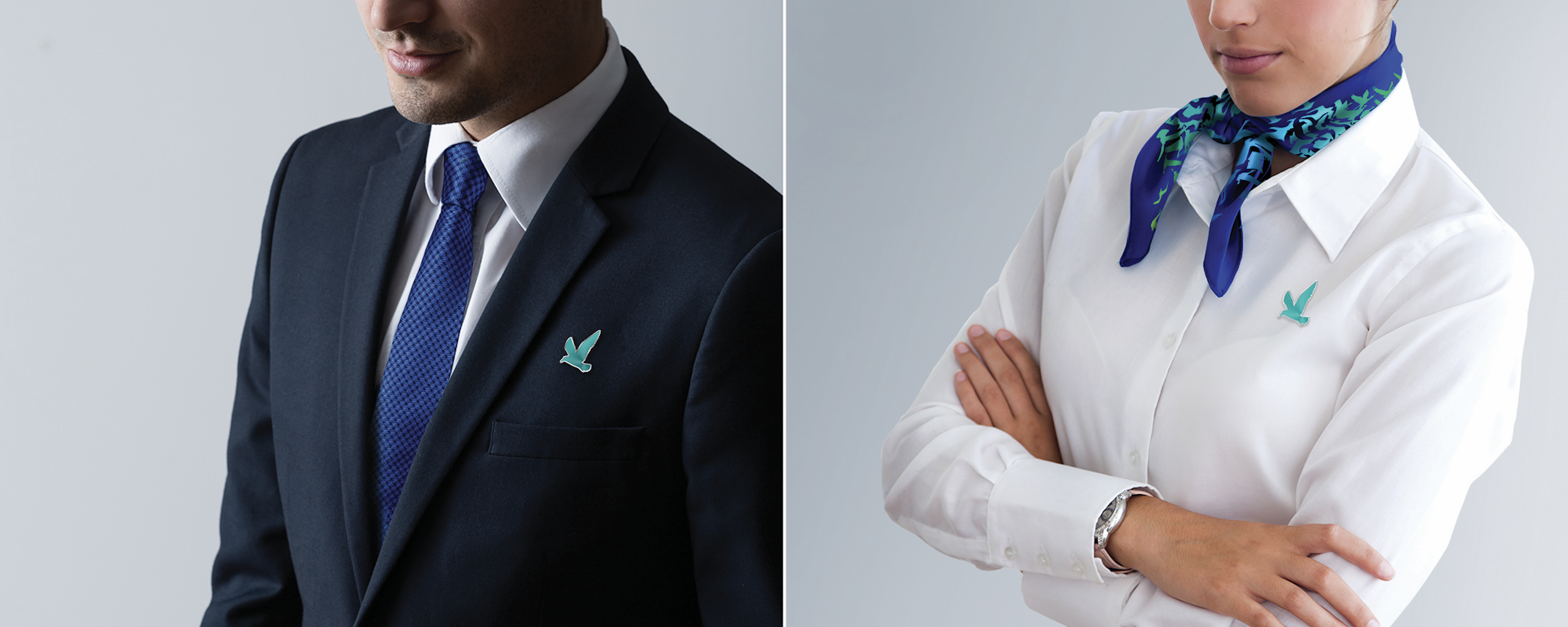
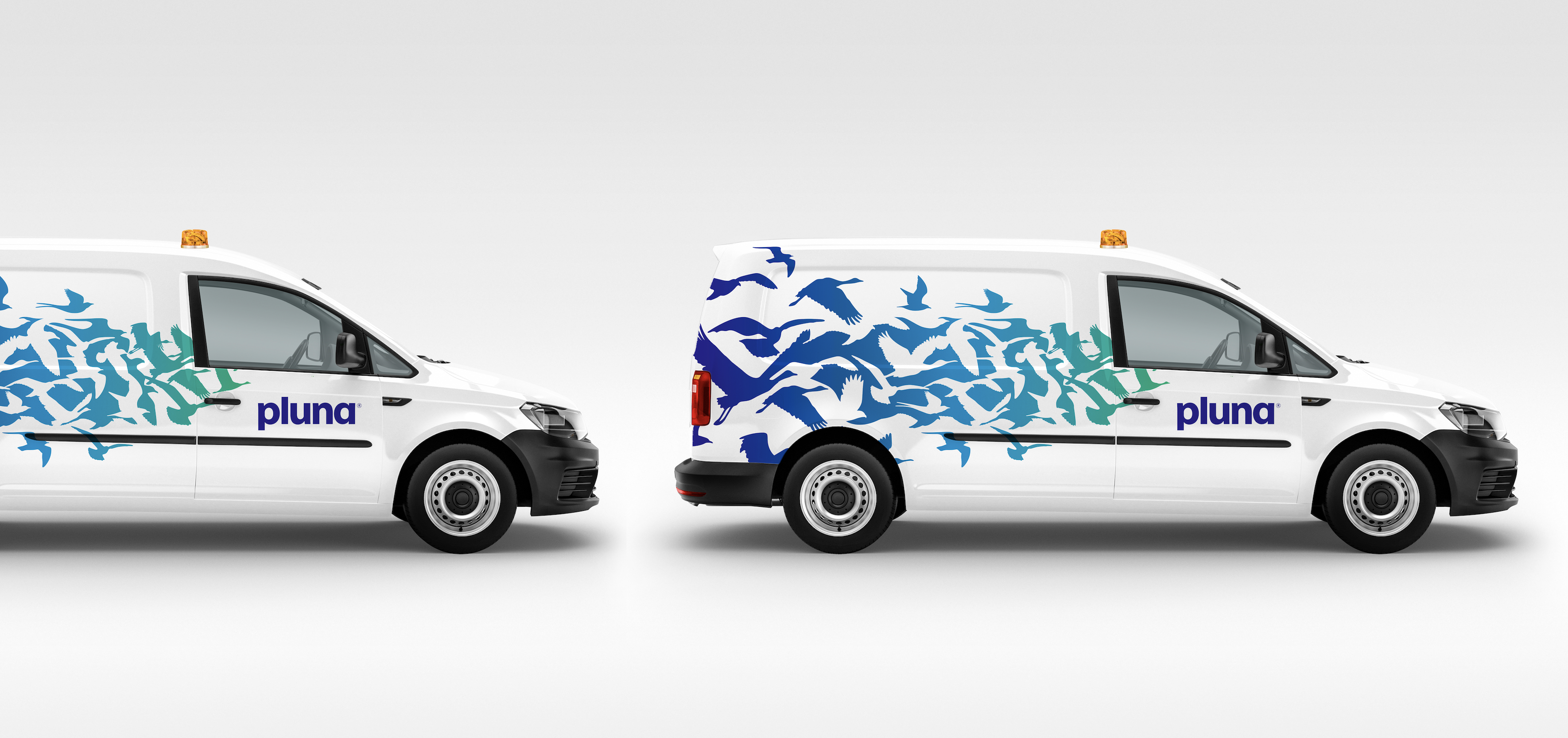
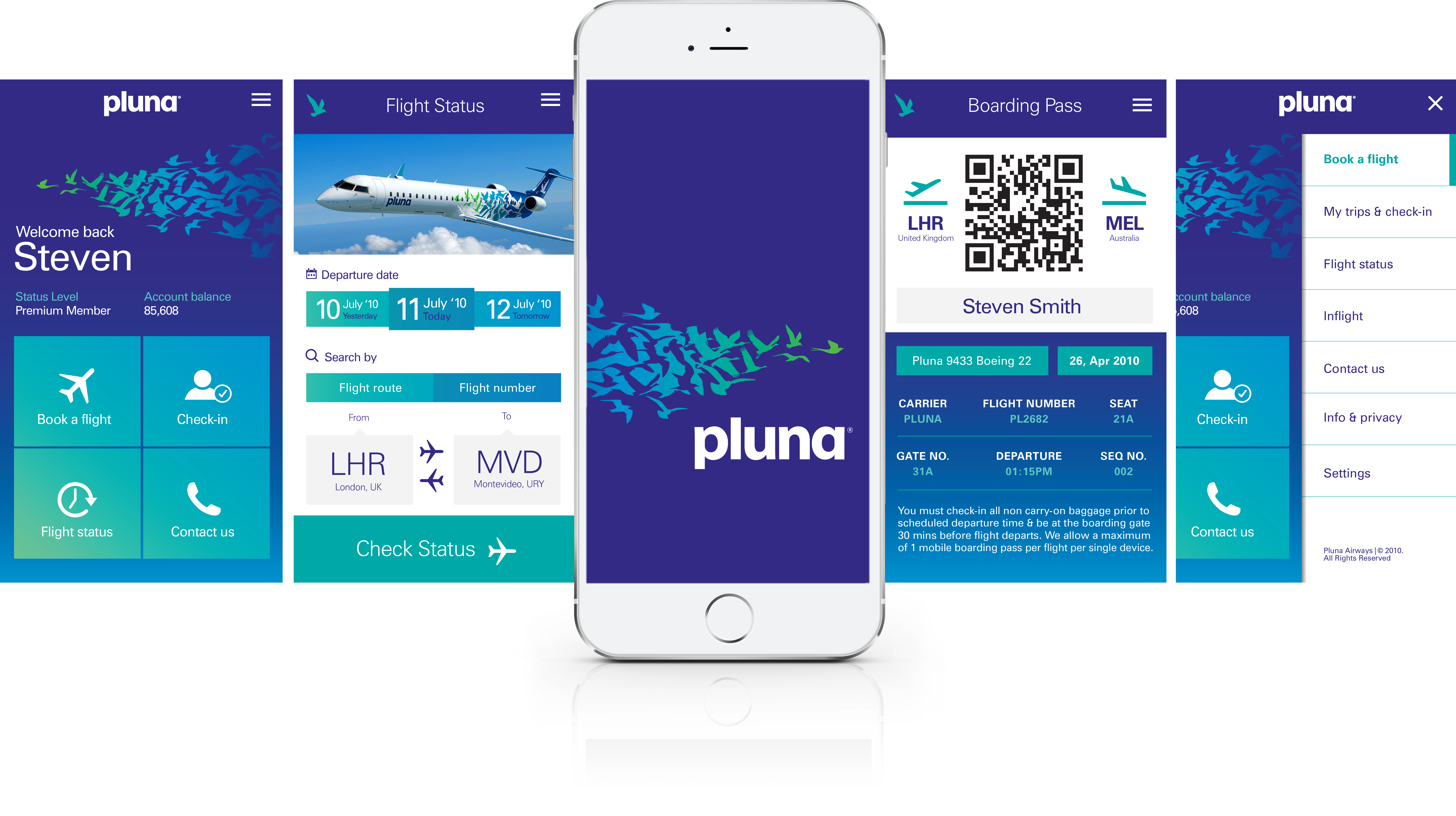
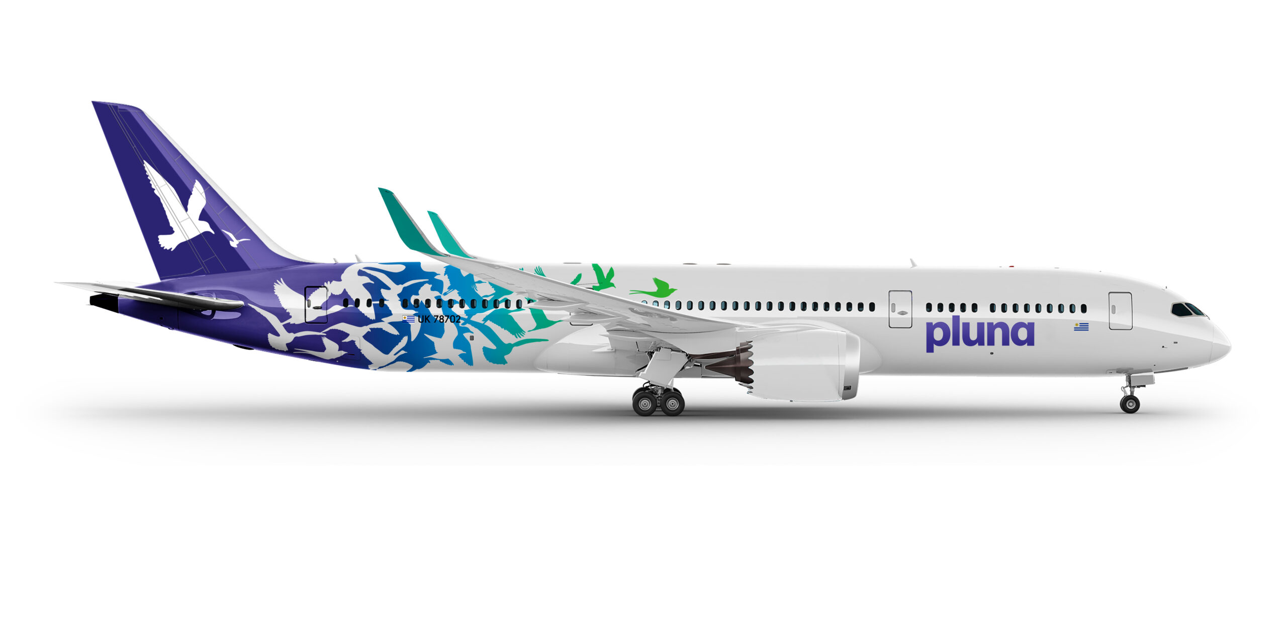
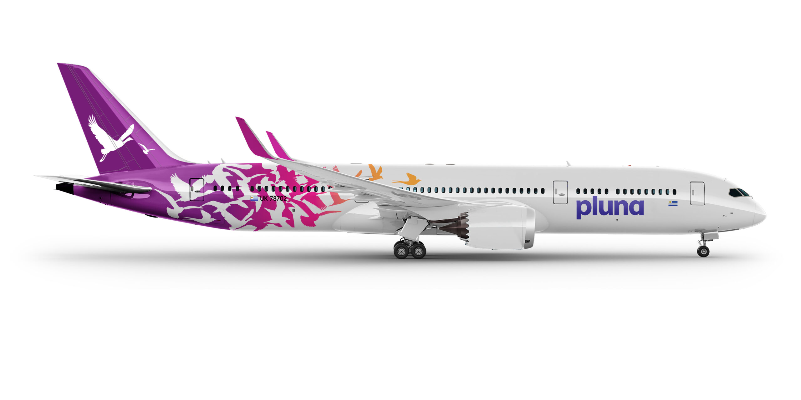
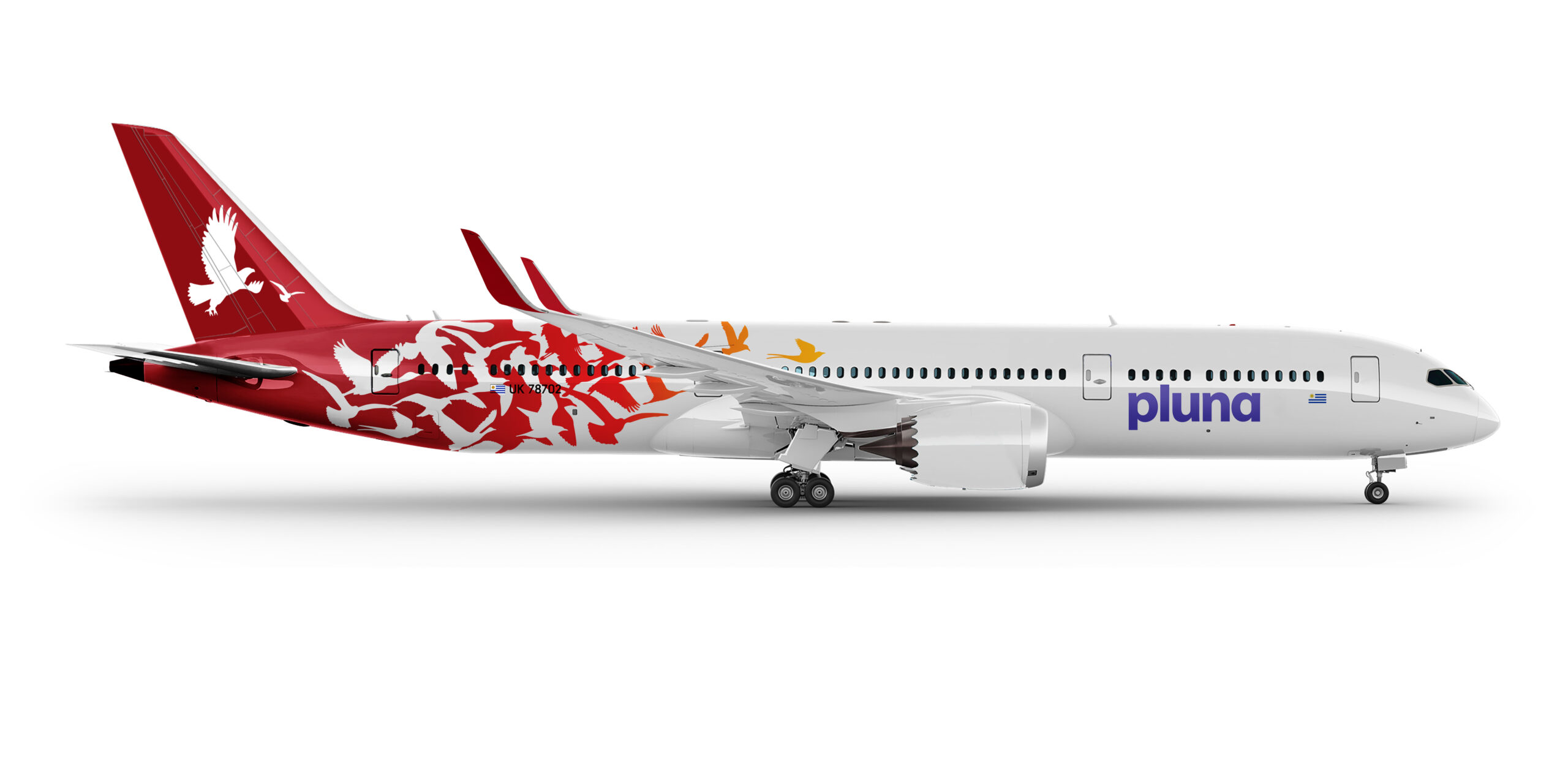
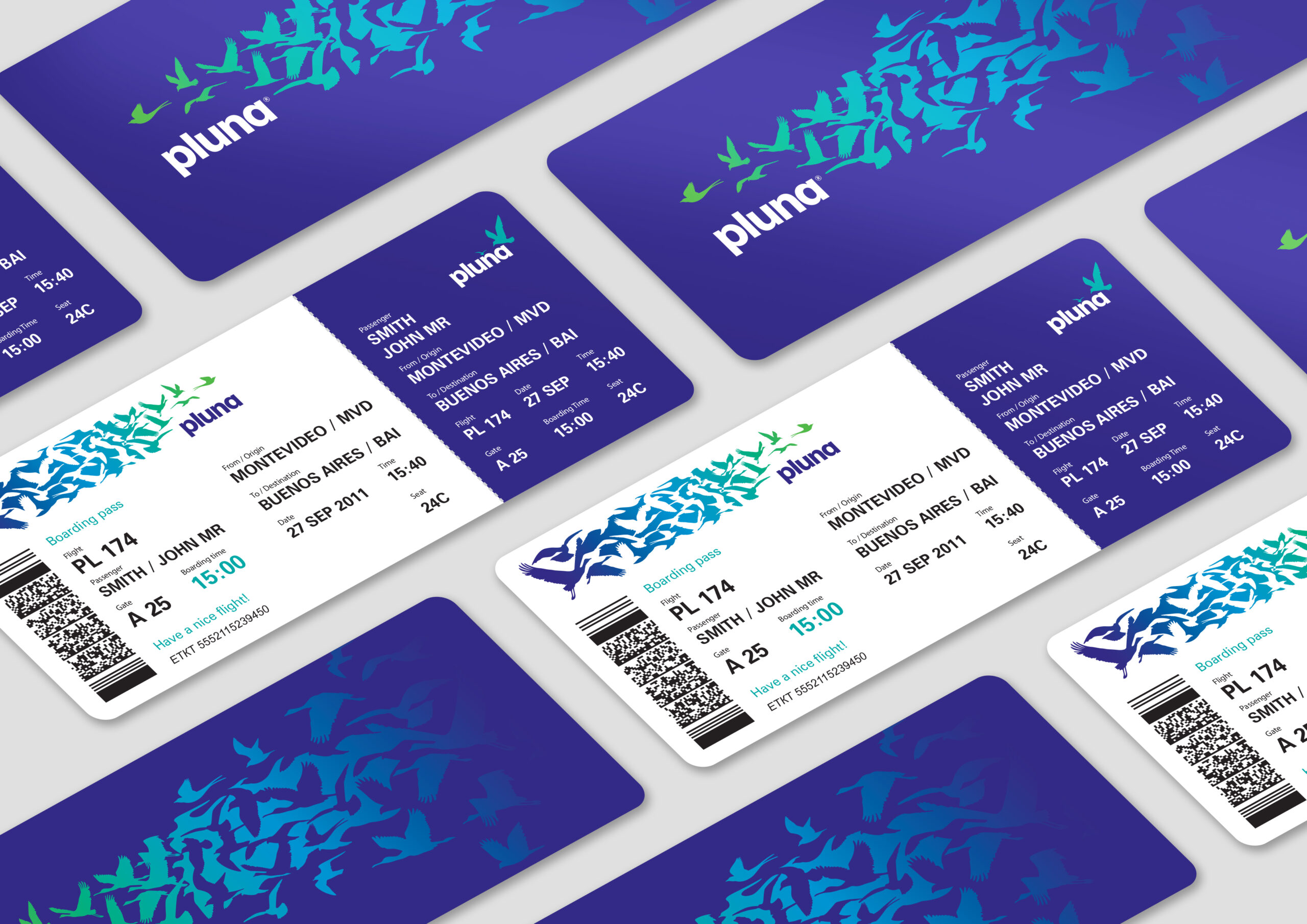
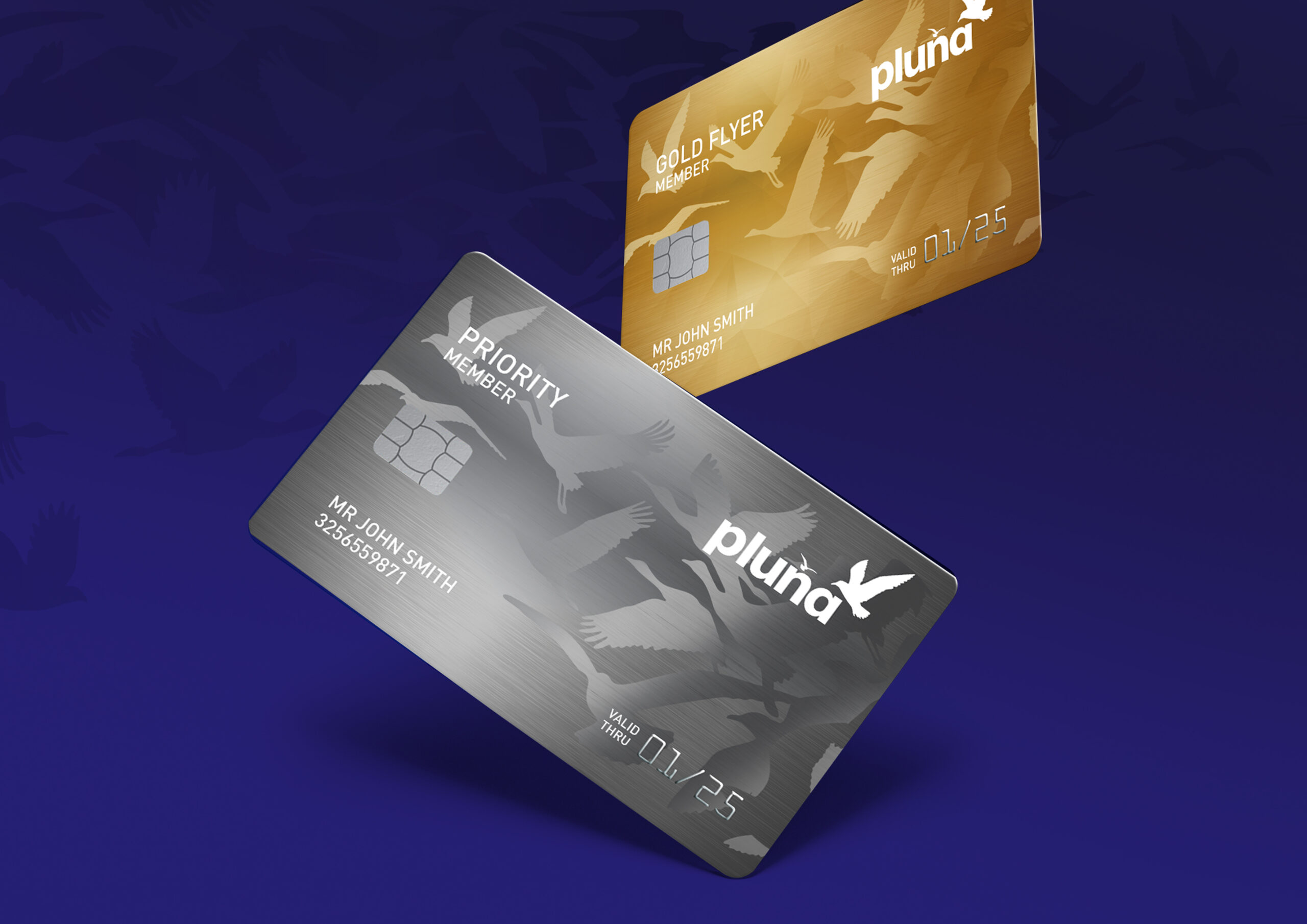
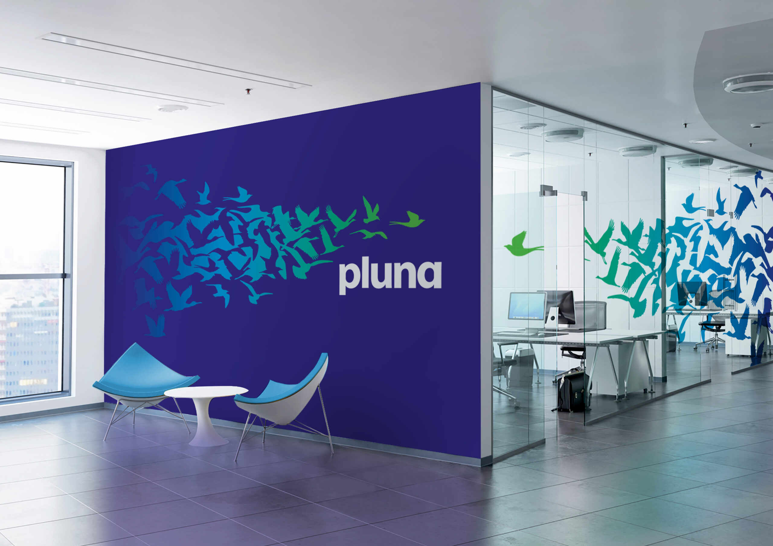
The rebranding featured an complete brand overhaul for Pluna™, departing from the brands previous dated blue and yellow look. I helped to develop a complex pattern of native bird shapes as the basis of the design, as well as a fuselage colour strategy to distinguish the airline's various flight routes. I was also involved in developing a loyalty reward program visual system as well as conceptualising the digital passenger experience.
