CHICKEN OF THE SEA
A WELL-LOVED BRAND FROM THE HEART OF THE OCEAN
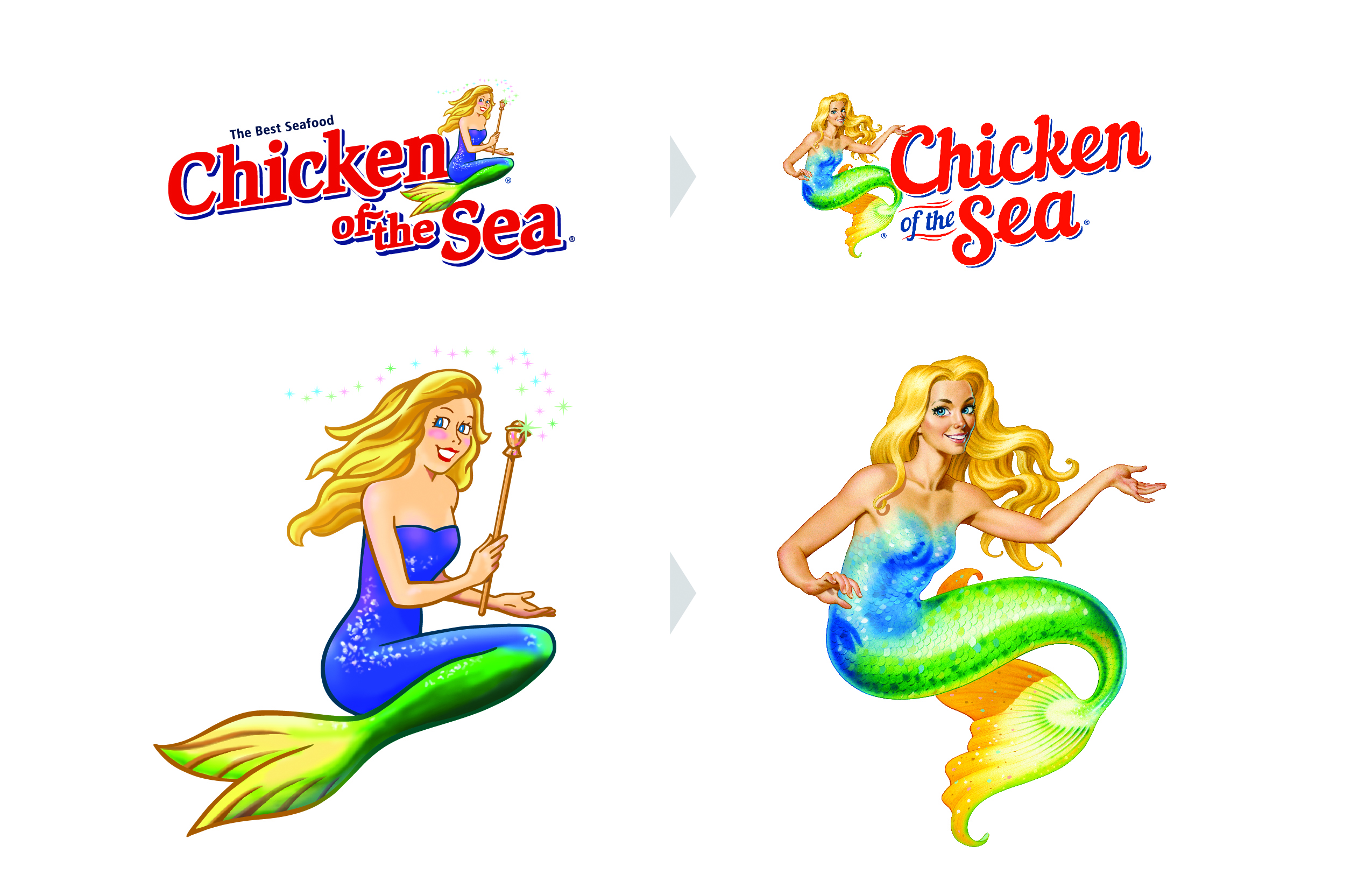
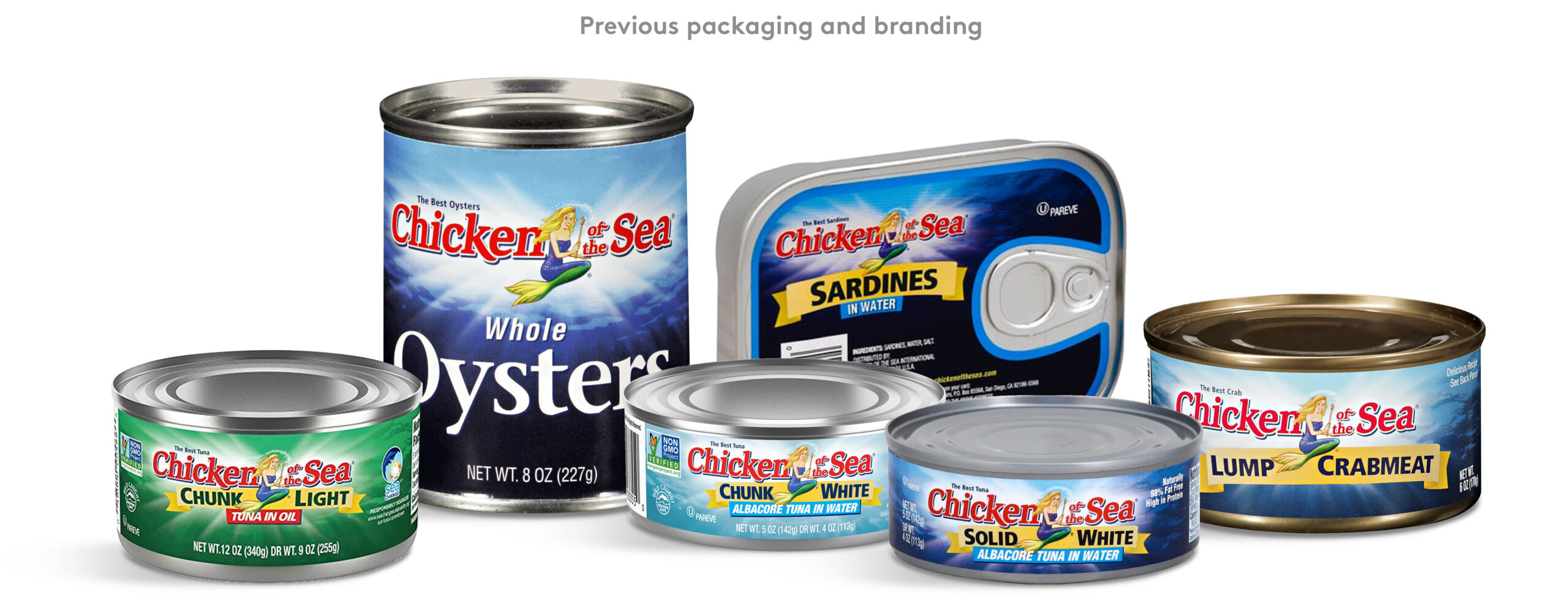
Founded in 1914, Chicken of the Sea™ is a leading name in retail seafood products throughout the USA, Canada, and abroad. In a post-WWII market, the brand cemented itself within American households and introduced its signature icon, ‘Catalina’ the mermaid. Decades later she remains a perpetual and key brand asset. In 2017, the company embarked on a Catalina branding refresh and built a new strategy around honesty and integrity within a growing environmentally-conscious consumer market. I worked with CBX™ on the new brandmark, packaging, sensory principals, and product photography.
CBX™ NEW YORK - 2017 - SENIOR DESIGNER

A FREE-SPIRITED BRAND
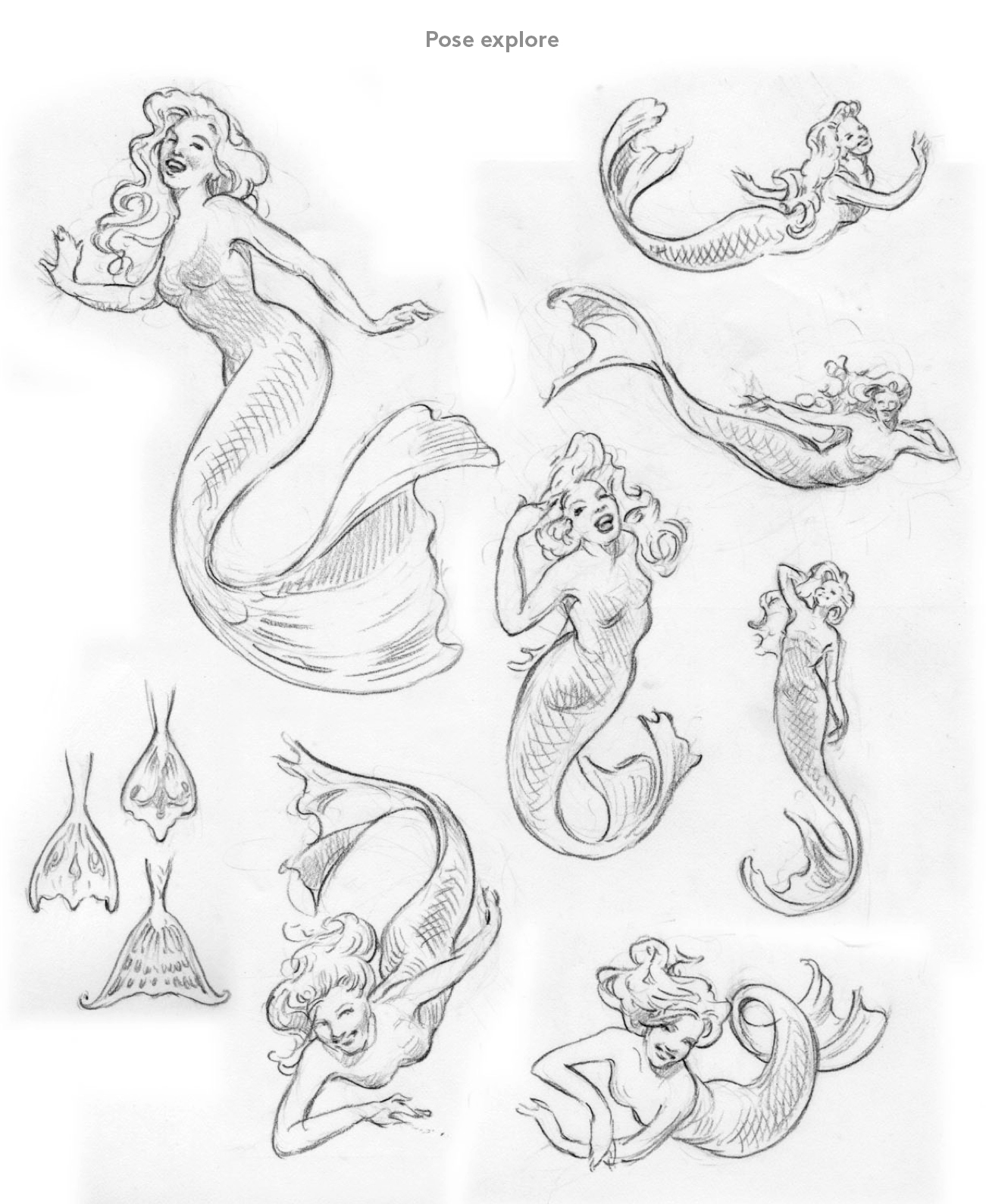
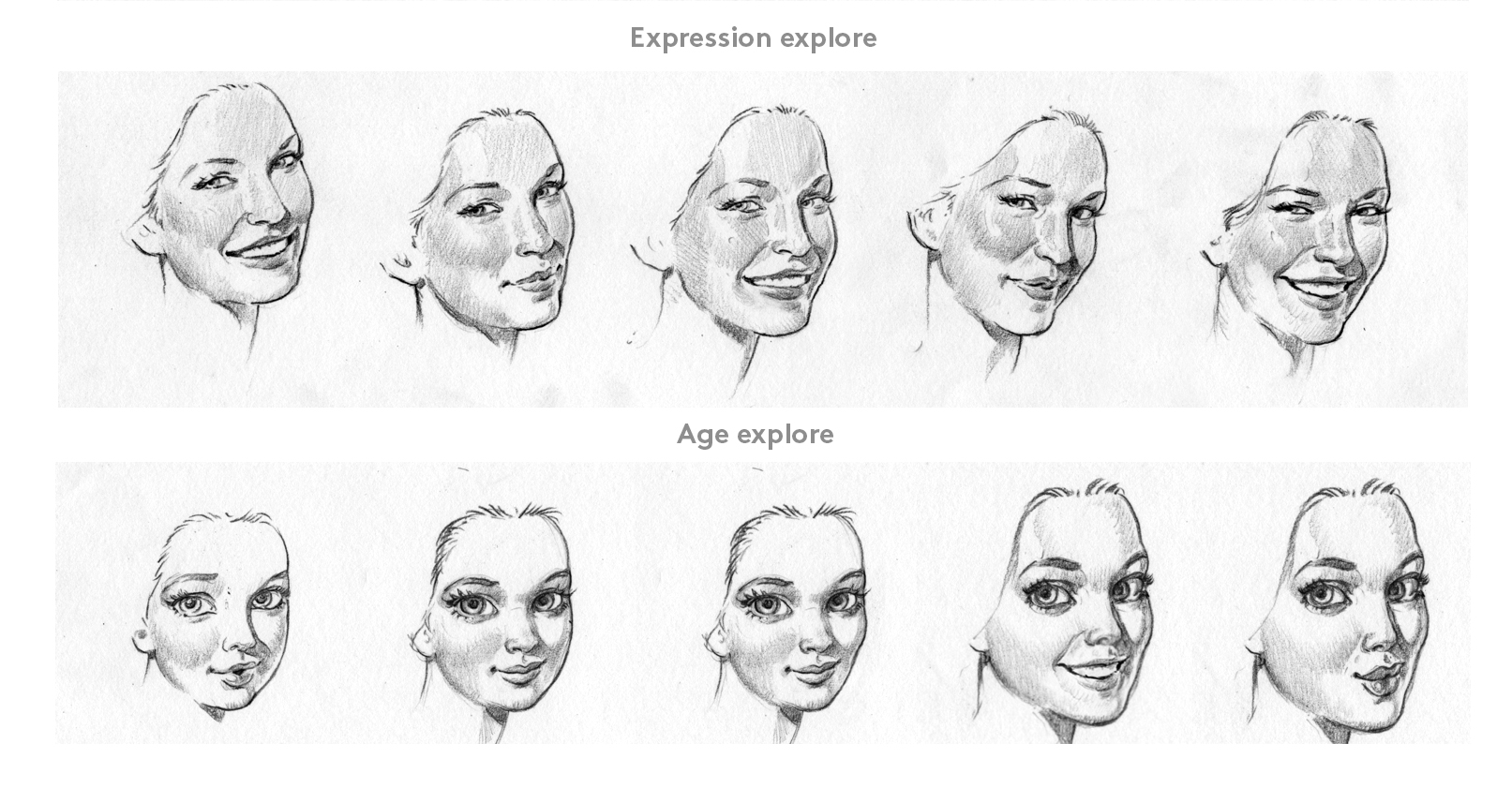
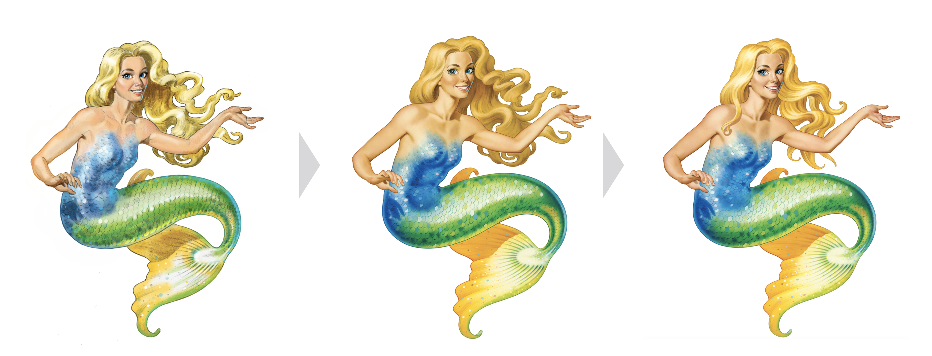
Working with CBX™ I partnered with professional illustrator Mark Stutzman to develop a new evolution of Catalina the mermaid. Building upon her recognisable attributes, we developed a significant character study that shifted from an outmoded ‘50’s kitsch housewife’ look to one that reflected a more modern ‘guardian of the sea’. Exploring new poses and expressions, we landed on an enhanced design that added to her magnetic appeal whilst serving as an endearing seal of quality.
NEW APPEAL FOR MODERN PALETTES
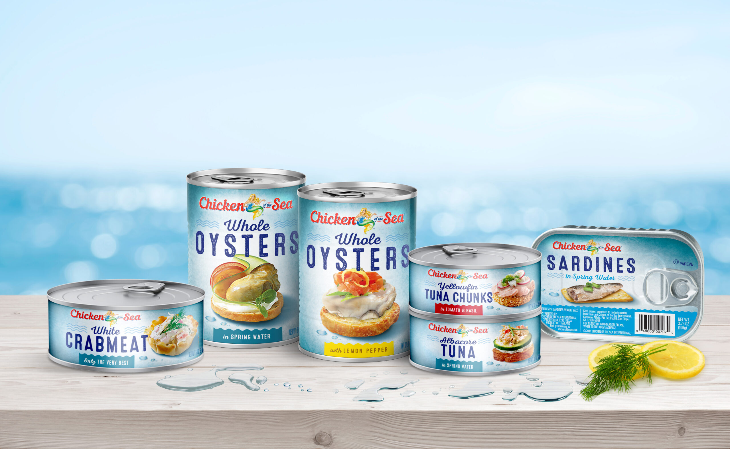
As an extension of the character study, I worked through a new typographic exploration. The aim was to fuse old-world seaside charm with contemporary seafood bistro culture. Paired with the refreshed Catalina mermaid icon, the resulting mark continued to honour the brand's history but added a more palatable and contemporary feel. I also worked on the new-look packaging that put an emphasis on flavour, with modern serving suggestions created in a lighter, fresher design.
